Really simple responsive menu
By admin on 02/03/2012
I've just published an update to this websites on-going theme development. I've introduced a few basic styling aspects including the Google webfont title, css gradient header and some basic formatting for the main content. Nothing too exciting but the most interesting aspect is the responsive menu which I'll dissect here for future reference.
What menu?
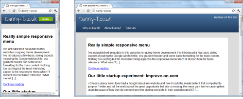
If you're looking at this on a desktop/laptop/tablet you'll probably be thinking this is the least exciting menu ever. You'd be correct, at the time of writing I've applied no styling to the actual menu itself yet. However, if you're on a mobile phone or if you narrow the browser window you'll see a menu button appear which upon pressing displays the considerably unexciting menu and pressing it again retracts it.

I've seen this type of responsiveness on a couple of sites and wanted to replicate here because it offers maximum viewing space for the site content without sacrificing functionality for small screen users. The menu displayed is the exact same menu on larger screens so there's no excess markup and we use progressive enhancement to add the show/hide functionality for Javascript enabled browsers so if your mobile browser doesn't support JS you'll see the menu expanded by default.
Some Code
First of all we have some semantic html for the header of the site:
Danny-T.co.uk
Mobile First
Because I was taking a mobile-first approach (which I highly recommend by the way), the next step was to setup the default styling in css:
    header[role="banner"] nav {

      width: 100%;

    }

    .js header[role="banner"] nav ul {

      display: none;

    }
So just a basic vertical list hidden. However note the .js class. Courtesy of modernizr, we can use this and know the display:none will only be applied if the user has Javascript enabled.
Adding the menu button
Next up, if the user does have a JS enabled browser we'll add the menu button to the header, this is done with some simple jQuery:
var header = undefined;
var menu = undefined;
var menuButton = undefined;
$(document).ready(function(){
header = $("header");
menu = $("header nav ul");
menuButton = $("
");
menuButton.click(showMenu);
header.append(menuButton);
})
function showMenu (event) {
if (menu.is(":visible"))
menu.slideUp({complete:function(){$(this).css('display','')}});
else
menu.slideDown();
}
All we're doing is appending a menu button to our header and attaching the click handler which reveals our list. (To jazz up the button I used the rather handy cssbuttongenerator.com)
Responding to larger screens
All we have to do now is apply the responsive element in order for wider screen users to not have to worry about the menu button:
    @media screen and (min-width: 480px) {

      .js header[role="banner"] nav ul {

        /* overrides the hiding of the menu */

        display: block;

      }

      .js header[role="banner"] nav ul li {

        display: inline;

      }

      .js header[role="banner"] .menu {

        display: none;

      }

    }
Note I had to keep the .js classes due to specificity.
So that's how I've added a responsive menu to the site theme. We've maintained semantically accurate markup and haven't had to fret too much over complex code thanks to modernizr, jQuery and media queries.
Any questions or feedback feel free to tweet me @dannyt or wait until I get to the comments part of the theme. Full theme source available on my github.
- Tags:
- Uncategorized
